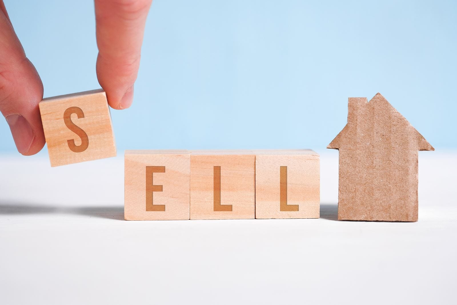
To Stage in Light or Dark: The Great Home Staging Debate
Because nothing says "buy me" like a home that looks like it drinks espresso and reads poetry.
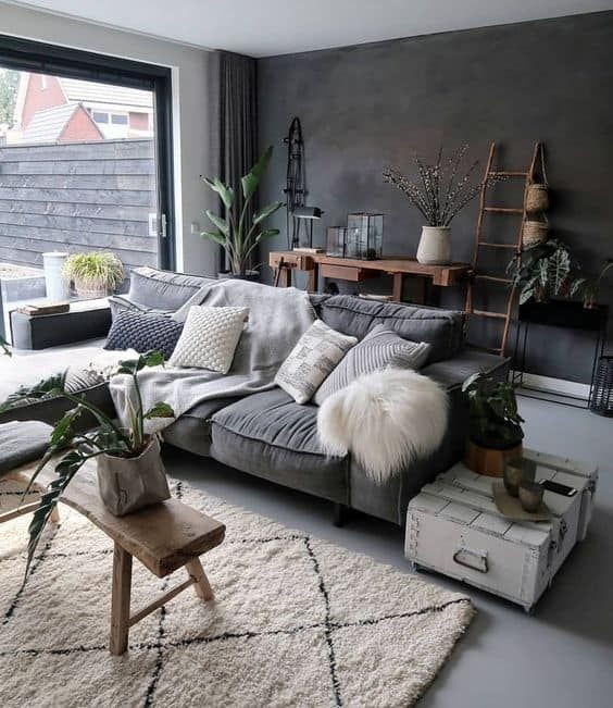
Turns out, dark and dramatic is in.
Gone are the days of 50 shades of beige. Today’s buyers are swiping right on homes with personality—think deep blues, cozy browns, and enough emerald to make the Wizard of Oz jealous. Home staging isn’t just about tossing a throw pillow and calling it a day. It’s about mood, vibe, and convincing people that they’ll become the kind of person who hosts dinner parties with jazz playing softly in the background.
According to stats (and your cousin who watches HGTV religiously), 81% of buyer’s agents say staging helps people picture themselves living in a home. Want love at first sight? Paint it mahogany, baby.
The Dark Side Has Cookies (and Great ROI)
There’s real psychology behind rich, dark colors. Navy, charcoal, and emerald don’t just look good—they whisper “luxury,” “warmth,” and “I have my life together.” Buyers subconsciously associate these hues with comfort and sophistication, which makes them more likely to open their wallets and offer over asking.
Want to amp things up? Go for bright, warm tones in social areas to spark energy and conversation. Or keep it chill with soft purples and greens in the bedroom so buyers envision themselves napping like royalty.
Staging Goes Moody (And That's a Good Thing)
If your listing still looks like a rental from 2009, it’s time to embrace the dark side—in the best way. Rich colors add depth and charm. They say, “I’m classy,” not “I was painted by a landlord in a hurry.”
Want your space to scream high-end brunch spot meets cozy speakeasy? Try this:
-
Living room: Deep navy accent wall + oversized art = drama in a good way.
-
Primary bedroom: Earthy tones + velvet pillows = restful retreat that begs for a nap.
-
Dining room: Moody green + gold light fixtures = dinner party goals.
Bonus points if you can work in Pantone’s 2025 Color of the Year: Mocha Mousse. It's a deliciously warm brown that sounds like a dessert and looks like a hug.
How to Use Rich Colors Without Creating a Cave
The secret to using dark colors without turning the home into Dracula’s summer house? Balance. Here's how:
-
Accent wall, not accent everything. Choose a spot—make it count.
-
Furniture that slays. Jewel-toned couches, velvet chairs, dark wood accents = instant glow-up.
-
Textures matter. Mix materials like leather, silk, and wool in deeper hues to add coziness without chaos.
-
Neutrals are your BFF. Creams, whites, and warm beiges will lighten things up so your rich colors don’t feel too heavy.
-
Metallics = magic. Brass, gold, or matte black accents bring sparkle without needing glitter (because this isn’t a kid’s birthday party).
Don’t Forget the Outside: Moody Curb Appeal Is Real
First impressions count. If the inside is giving "luxury retreat," but the outside screams "fixer-upper chic," you're losing buyers before they even ring the doorbell.
Consider these curb appeal power moves:
-
Paint the front door something bold. Navy, black, or deep red = instant character.
-
Trim touch-up. It’s like eyeliner for your house—clean, sharp, and makes everything pop.
-
Fancy up the entryway with cute planters or stylish new lighting. (Bonus: buyers think the inside’s just as updated.)
The latest exterior trends? Warm neutrals, bold blues, and greens so rich they should have their own bank account. Use them to highlight architectural features and give the house an upscale, modern-yet-timeless vibe.
Bottom line?
Color isn’t just décor—it’s a strategy. The right moody hue can make a home feel like “the one.” So go ahead, paint it mocha. Stage it like a magazine spread. And get ready for buyers to fall in love faster than you can say “open house.”
Categories
Recent Posts